
21. PRETTY PINK
1:19:00 PM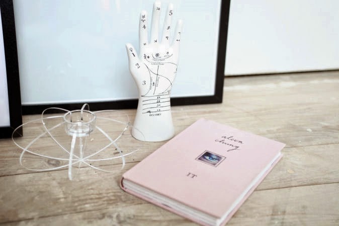
Je vois la vie en rose...
Earlier, during my teens, I had a room in bright pink. Almost candy pink, which made you feel like you were walking around in a candy store. It was just too much and too crazy. So while making the moodboards for my interior, I was sure about one thing: no bright pink will appear in my rooms. But ofcourse, as a girl, you should love pink. Even if it's soft pink or the 'old' pink color. We love it and can't deny that fact. So yes I succembed for a small 'touch of pink' in my interior.
The 'touch of pink' isn't like a huge wall painted in that color, but it's a nice detail for the livingroom (on a small table or on the shelves). Alexa Chung's book is just too pretty and the fabric of the cover makes you want to have it immediately. It has a sophisticated, girly look. I found this copy at the American Book Store in Amsterdam at 't Spui. It's such a huge book store and defenitely has more than 5000 different books! If they weren't so heavy,
I would've came home with a book about Balenciaga, Louis Vuitton,...
And not only the color, soft pink, caught my eye. The last time I always look for posters. After receiving the MONOMINI prints I wanted to look for some bigger paintings. Small or big, both can give a personal touch of art into your room. And it's a fact that I'm not a huge fan of ART, so this black and white/minimalistic touch is perfect for the style I want to create. Non, je ne regrette rien!


(Big poster with flower from Paper Collective // Candle holder & small poster from COOEE // Urban Outfitters jewelry hand // Alexa Chung book)


1 comments
mooi, ben super benieuwd naar hoe je huisje eruit gaat zien! succes ermee :)
ReplyDeletexo Elien
Dogs and Dresses - personal style blog from Belgium
Thank you for leaving a comment. I will answer your questions as soon as possible!